

Ibotta: Making cash back click on day one.
Ibotta: Making cash back click on day one.
Staff Product Designer. Home, onboarding, and the system underneath them.
Ibotta pays people cash back on things they already buy, from groceries to gift cards. When I joined, the app looked dated, and new users were left to figure out on their own how earning actually worked.
As a Staff Product Designer, I led the redesign of the home screen and the first-run experience for 4M+ daily active users, built on Pando, the design system we launched with the 2020 rebrand.
ROLES
Research
Testing
Interaction Design
Interface Design
Design Systems
Implementation
PLATFORM
iOS
Android
Web
YEAR
2021–23
THE PROBLEM
Cash back is a simple promise. The app around it had gotten complicated.
Simplify the first five minutes. New users need three things: pick a retailer, add offers, redeem. Everything on home should move them toward that loop, and nothing should get in its way.
Make the brand feel like the product. The 2020 rebrand was a chance to make the app feel the way getting money back should: brighter color, bolder type, and illustration with some personality.
Build it to last. Every new screen was designed on Pando, our new design system, so the next squad could start from components instead of from scratch.
HOME
Home had to welcome someone on day one and stay out of their way on day one hundred.
It's the first thing people see every time they open the app, so it has to do a lot without feeling like a lot. I rebuilt it around how people actually shop, with quick entry points for Groceries, Online and Gift Cards right at the top.
New savers get a welcome bonus and a short card that shows them how Ibotta works, in the slot that used to hold an ad. Regulars get favorites they can set right from home, and retailers they can filter by how they shop instead of scrolling past them.
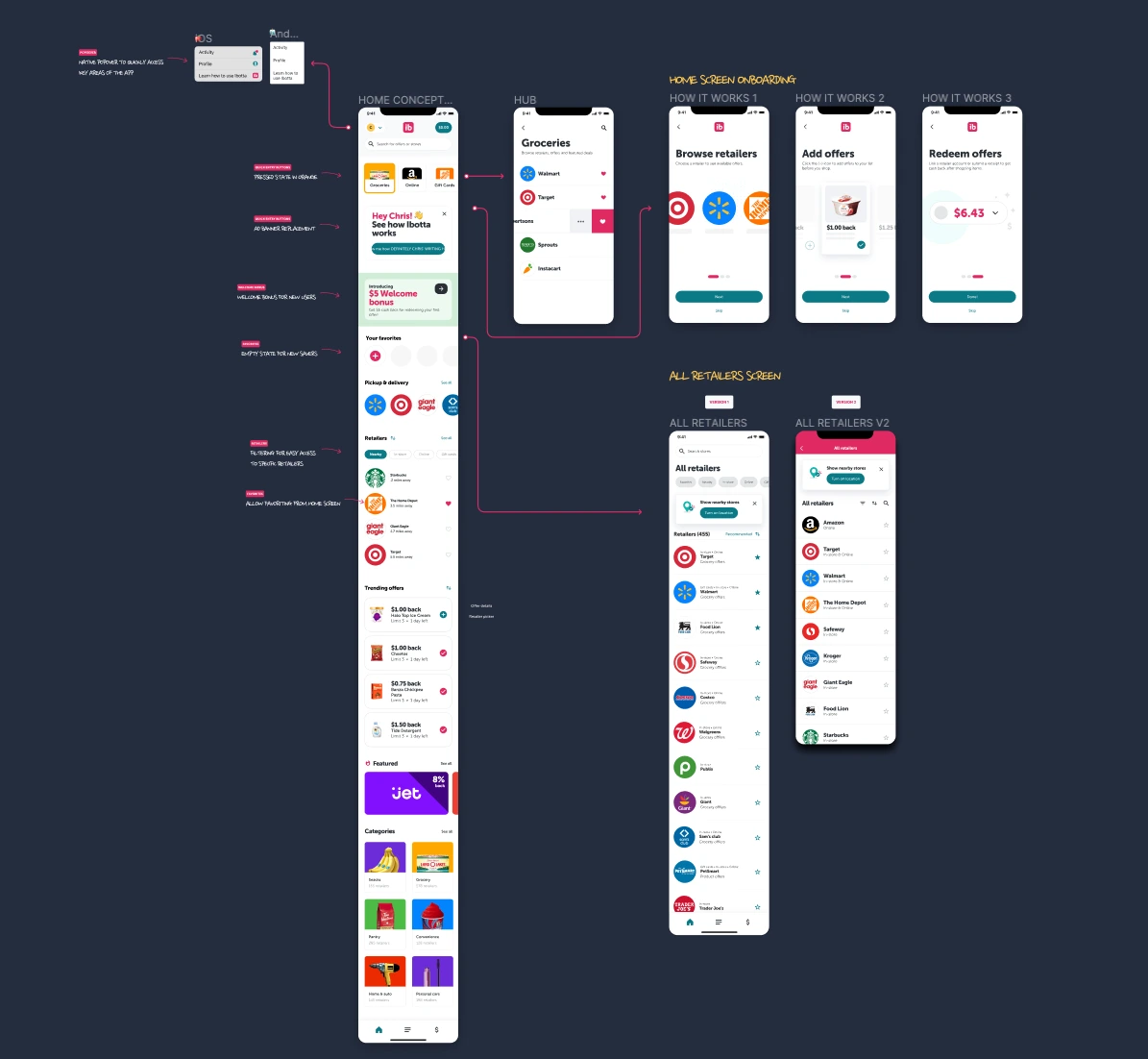


Before and after. Drag to compare.
THE DETAILS
The small interactions got the same attention as the big ones.
A tap on your avatar opens a native popover to the places people reach for most: Activity, Profile, and a shortcut back to learning how Ibotta works. No hunting through tabs, and no leaving home to get there.
ONBOARDING
New users didn't need a tour. They needed three steps.
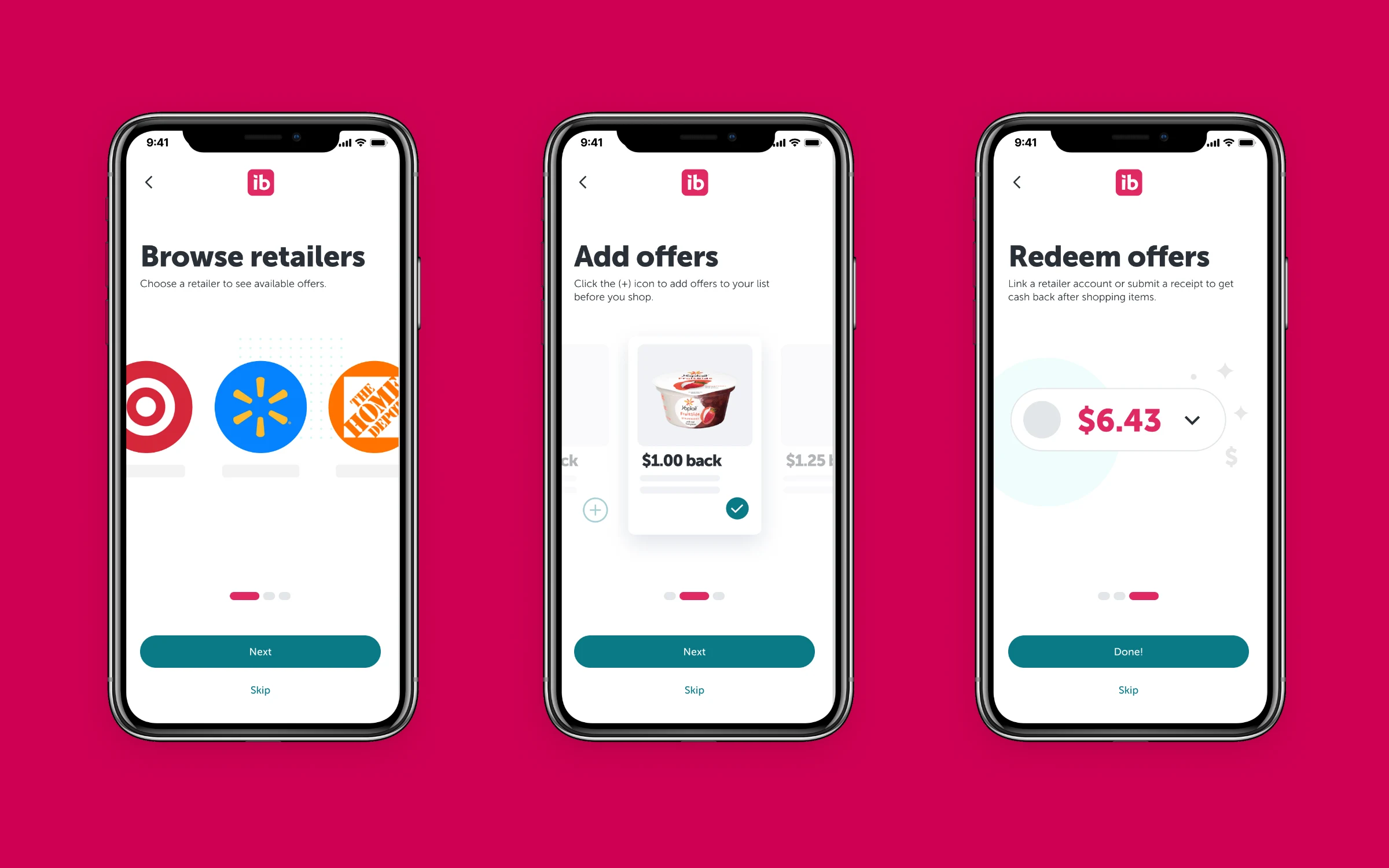
Ibotta makes sense the moment you've done it once: browse a retailer, add offers, redeem. So the first-run flow teaches exactly that, in three screens, with real retailers and real offers instead of illustrations of the idea.
Skip is always one tap away. The goal is someone's first dollar back, not finishing a tutorial.
LEARNING CENTER
Onboarding gets someone to their first dollar. The learning center keeps them earning.
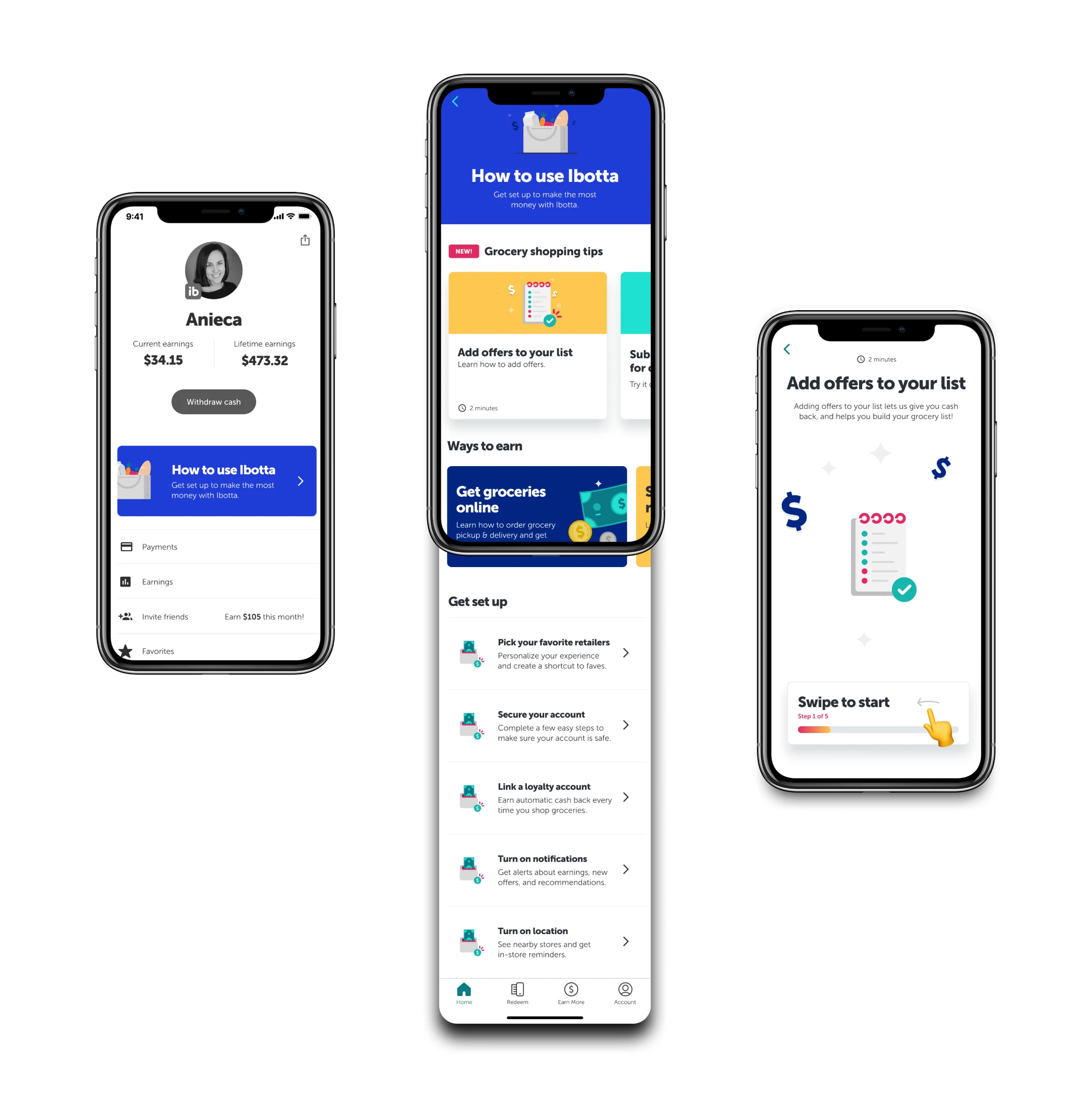
How to use Ibotta lives on the Account screen, right under your earnings. It breaks earning down into short guides with time estimates: grocery shopping tips, every way to earn (receipts, pickup and delivery, Pay with Ibotta, shopping online), and a set-up checklist for favorites, loyalty accounts, notifications and location.
Each guide is bite-sized and swipeable. Adding offers to your list takes two minutes and five steps.
HANDOFF
Designed on Pando. Handed off with the details engineers actually need.
We launched Pando, Ibotta's first design system, alongside the 2020 rebrand, and it grew to support a 700+ person org. Everything here was designed on top of it.
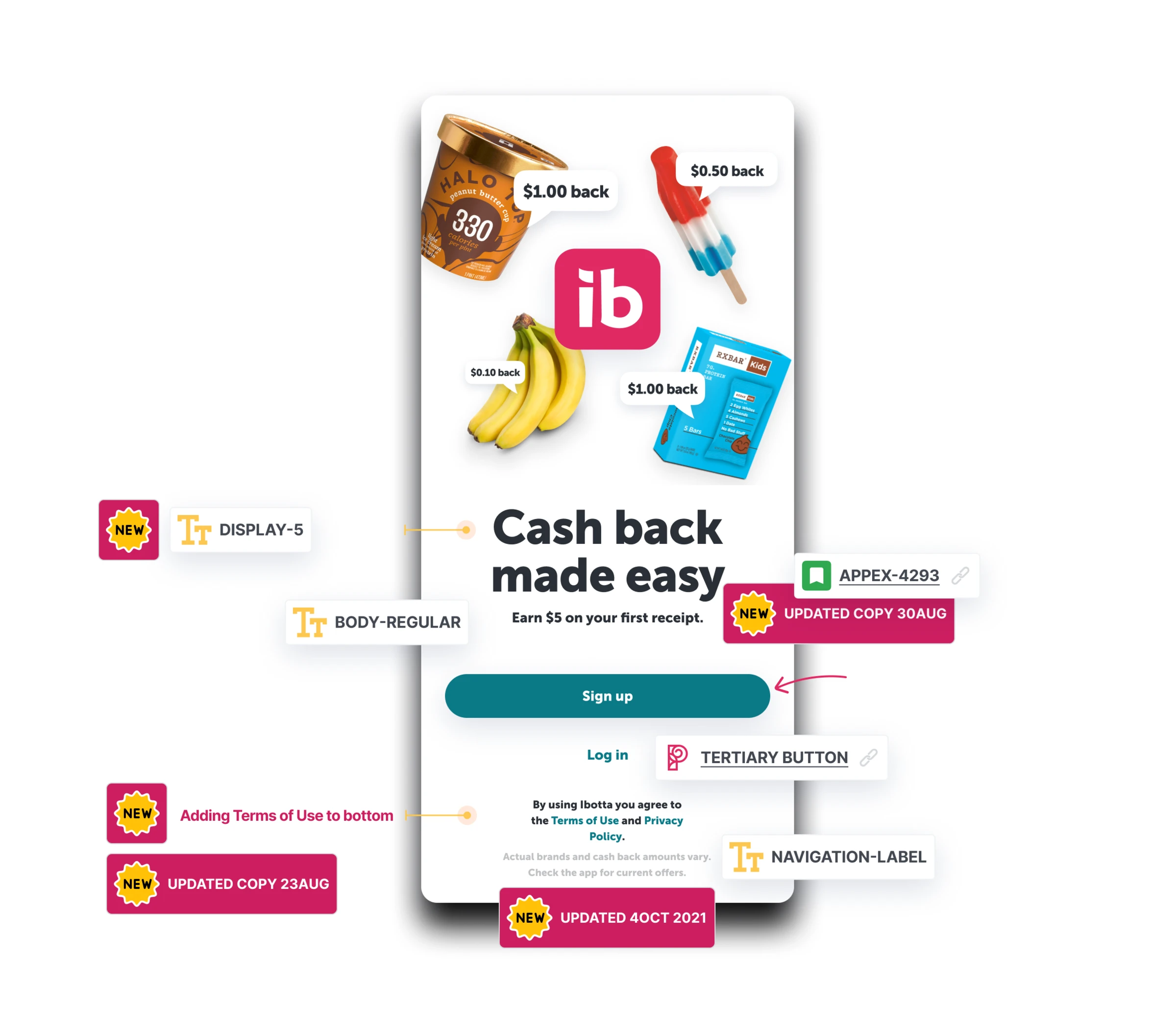
Handoff files called out the exact type tokens, button styles and Jira ticket behind each change, with copy updates dated right on the screen, so nobody had to guess.
4M+
daily active users
700+
person org on Pando
3
platforms: iOS, Android and web

Wanna see it in action? Just ask!
Wanna see it in action? Just ask!
Wanna see it in action? Just ask!
Reach out to me at ck@chrisknutson.design
Reach out to me at ck@chrisknutson.design
Reach out to me at ck@chrisknutson.design