
Liminal: a governed AI workspace for regulated industries. Defining how teams use multi-model generative AI without giving up control of what they send them.
Founding designer. Every surface, web and mobile.
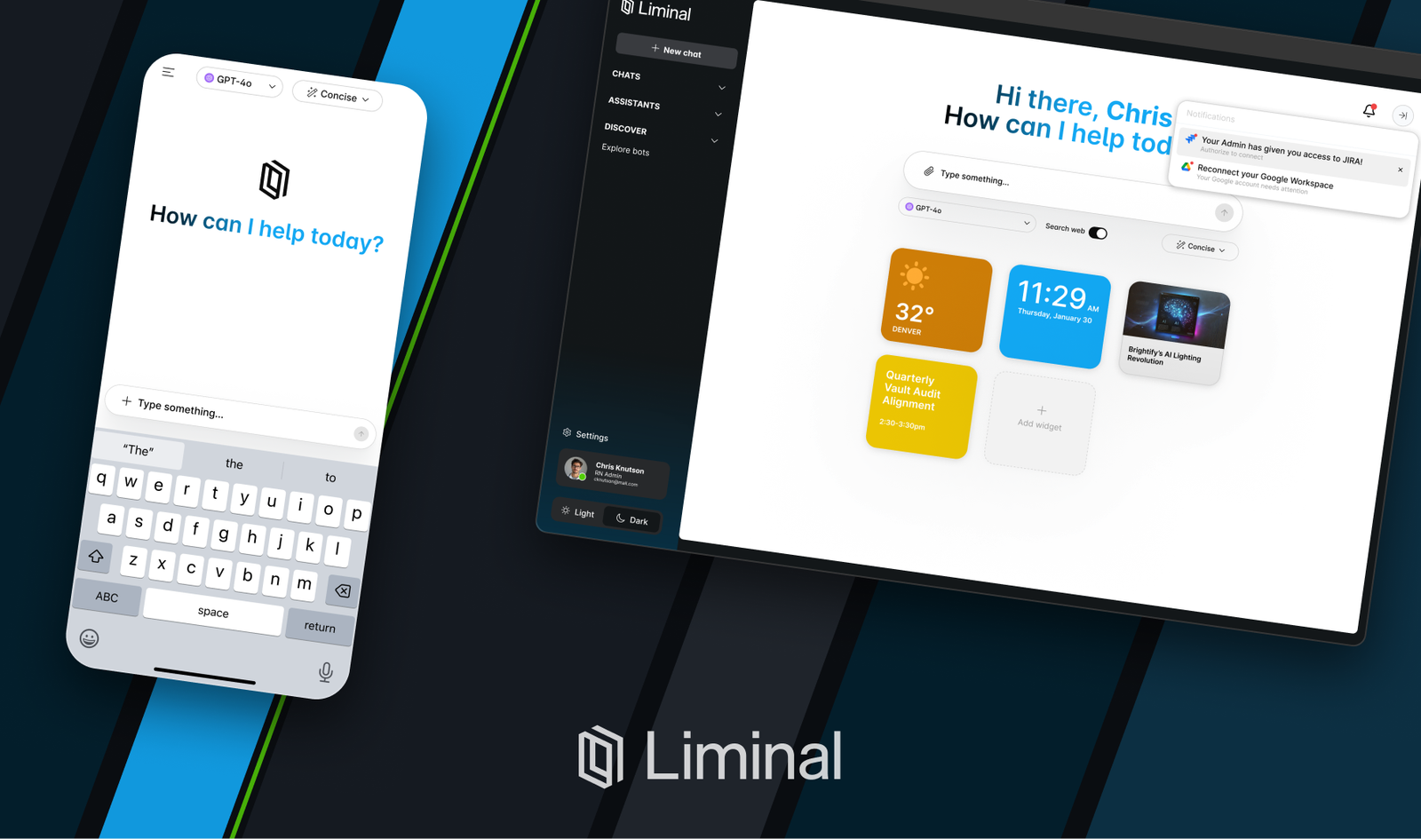
As the founding product designer at Liminal, I design the whole surface area of a secure AI platform — the chat itself, the controls around it, the admin tooling behind it, and the mobile app.
The premise is simple. People in healthcare, finance, and government want the same models everyone else is using. Their legal and security teams can't let them paste sensitive material into a consumer chat window. Liminal sits in between: a workspace where teams can work with OpenAI, Anthropic, Google and others, and where everything that leaves the organization is governed on the way out.
I'm the only designer here. That means I own the thing end to end — strategy, interaction, interface, the design system, the words in the product, and a lot of the front-end conversation with engineering.
As a Product Designer specializing in Design Systems, I played a pivotal role in the development of Rosetta, Handshake's inaugural design system. I collaborated closely with cross-functional teams to establish a cohesive visual language and component library, in code & Figma, ensuring a consistent user experience across the platform.
Through research and iterative design processes, we crafted a versatile system that empowered our product teams to streamline their workflows and deliver a polished, unified language to our users.
ROLES
ROLES
Product Strategy
Research
Interaction Design
Interface Design
Design Systems
Content Design
Prototyping
Implementation
Research
Testing
Design
Implementation
Documentation
PLATFORM
PLATFORM
iOS
Android
Web
iOS
Android
Web
YEAR
2023-now
YEAR
2022-now
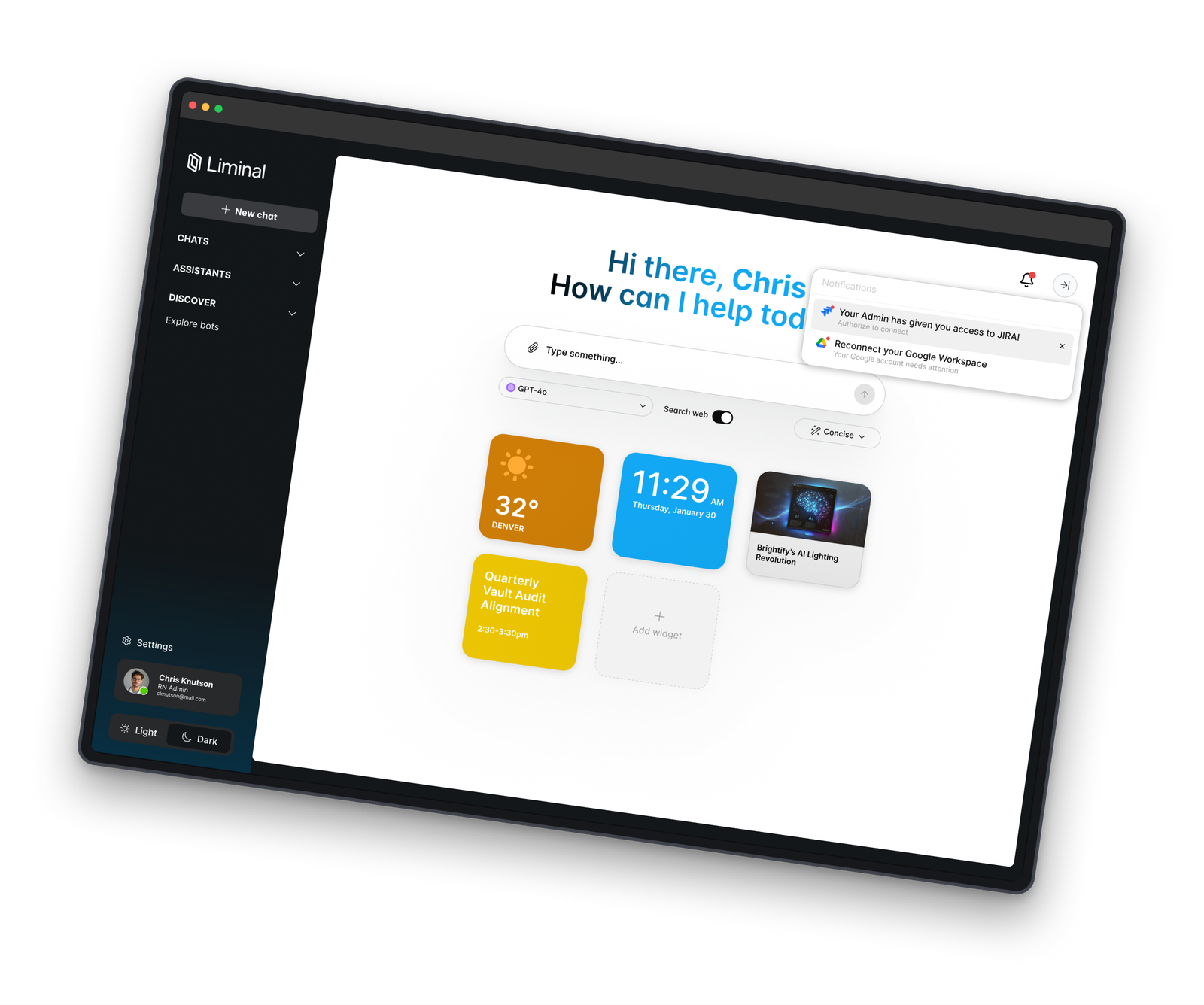
Liminal is a few different things at once. A multi-model chat client, a governance layer, and an admin surface — all of which have to feel like one product.
Multi-model, by design. People shouldn't have to pick a vendor and live with it. The model is a control that sits with the prompt, alongside web access and response length, so switching is a decision you make per question rather than a setting you configure once and forget.
Governed without feeling policed. The protection state lives on the message itself, not in a policy document nobody reads. If something was caught and handled, you can see that it was, right where it happened.
Built for the people who have to answer for it. Admins get real surfaces — connections, model configuration, usage — because in a regulated org the person who approves the tool is rarely the person using it.
Unified Visual Language: Handshake's design system provides a consistent and cohesive visual language, including color schemes, typography, and UI components. This ensures that all products and interfaces maintain a uniform and professional appearance.
Efficient Collaboration: It serves as a centralized resource for designers and developers, offering pre-defined design patterns and guidelines. This facilitates efficient collaboration, speeds up development, and reduces design and coding inconsistencies
Enhanced User Experience: By adhering to the design system, Handshake can deliver a seamless and user-friendly experience across its platforms and products. It gives teams a common language.
Unified Visual Language: Handshake's design system provides a consistent and cohesive visual language, including color schemes, typography, and UI components. This ensures that all products and interfaces maintain a uniform and professional appearance.
Efficient Collaboration: It serves as a centralized resource for designers and developers, offering pre-defined design patterns and guidelines. This facilitates efficient collaboration, speeds up development, and reduces design and coding inconsistencies
Enhanced User Experience: By adhering to the design system, Handshake can deliver a seamless and user-friendly experience across its platforms and products. It gives teams a common language.
Everyone ships the same empty text field. It's the easiest thing to build and the hardest thing to walk into on a Monday.
A blank prompt is a great demo and a bad product. It tests whether you already know what to ask. In a hospital or a bank, most people don't — not because they aren't capable, but because nobody has shown them what this thing is good for in their job.
So the landing surface isn't an empty chat. It's a configurable home: widgets, recent threads, the assistants your org has actually set up. The prompt is still right there. It's just not the only thing there.
The same instinct shows up in the controls. Model, web access, and response length are three of the highest-leverage decisions a person can make, and in most tools they're buried two menus deep or missing entirely. I put them under the composer as first-class chips.
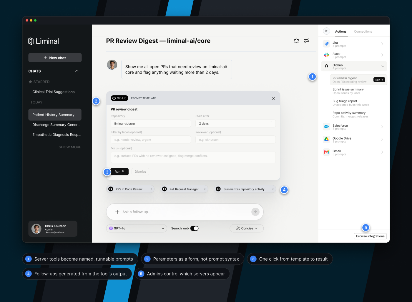
The sign-in is the first thing a customer's employee sees, and it was doing none of the work.
Production dropped you onto a plain form. The proposed version does three jobs at once: it tells you where you are, tells you why you were redirected here, and shows the product doing something useful before you've typed a word.
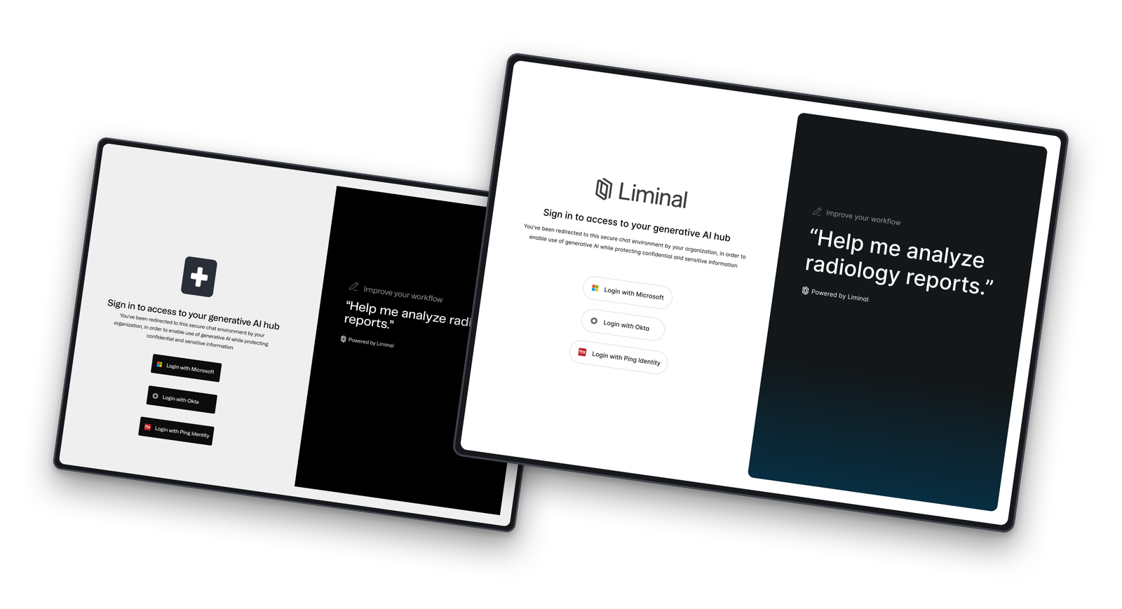
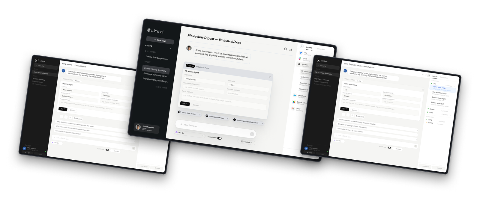
Connecting a tool is the easy half. Knowing what to do with it is the half everyone skips.
You can wire up GitHub, Slack, Jira, Salesforce, Drive and Gmail and still leave people staring at a blank box. A connected tool that nobody knows how to invoke is just a security review you paid for and didn't use.
So the integrations aren't a list of servers. They're a rail of named, runnable prompts — PR review digest, sprint issue summary, channel digest, standup recap. Pick one and you get a small form with the parameters filled in with sensible defaults, not a syntax you have to learn.
It turns "we integrated with Jira" into "here are four things you can do with Jira right now," which is the version a nurse manager or a compliance analyst can actually use.
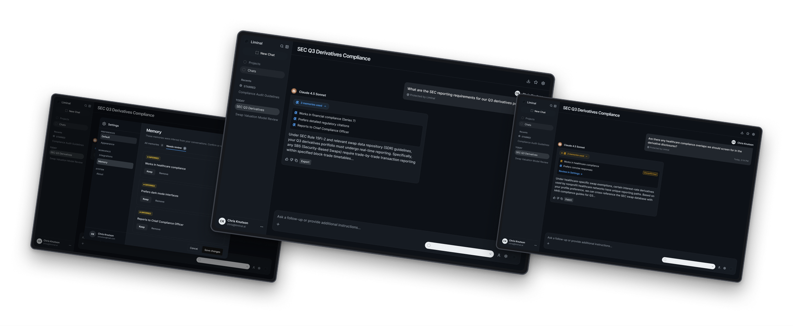
Memory is the feature most likely to feel like surveillance. That was the whole design problem.
Every assistant is racing to remember things about you. In a regulated workplace, "the tool quietly learned something about me" is not a delightful surprise — it's an incident.
I explored this as a spike and worked through the routes properly. Where does a memory get captured? Does the person confirm it, get told after the fact, or never see it? What happens when the system infers something rather than being told it directly?
The version I landed on is quiet by default and loud when it matters. Ordinary capture happens without ceremony. Retrieval is visible in the answer — you can see what it used and expand it. And when the system has inferred something rather than being told, it escalates: that one gets surfaced for confirmation, because a wrong inference sitting silently in your profile is the failure mode that actually hurts.
Then there's the boring part that decides whether any of it works: what this looks like at one memory, at ten, and at forty. And a review queue, so there's always a place to go and see everything the system thinks it knows.
No design team, no handoff ritual, no one to escalate a decision to. It's the most range I've had and the sharpest constraint I've worked under.
Everything is a trade against everything else. Time spent on the memory spike is time not spent on admin. So the job is as much about sequencing as it is about craft — knowing which surface actually blocks the company this month.
What I've leaned on hard is the thing I spent the last several years building at Ibotta and Handshake: a system underneath the work. Tokens, a component set, dark and light from the start rather than bolted on later. Not because a startup at this stage needs a design system in the formal sense, but because it's the only way one person covers this much ground without the product drifting apart.
The other half is writing. In a governance product the copy is the interface. A badge that says the wrong thing about what was protected is worse than no badge. I write most of the product language here, and it's some of the highest-leverage work I do.
2 Design systems designers
10 Engineers
1 Chief Design Officer
1 Engineering Manager
Implementation
I teamed up with 10 engineers spanning Frontend, iOS, and Android development to create and manage 400+ components for Rosetta, our Handshake design system. In just six months, we pushed adoption from 20% to 70% of our codebase. This collaborative effort streamlined development, maintained design consistency, and significantly improved our product's quality. Our teamwork demonstrated the value of Rosetta as an essential asset in Handshake's design and development toolbox.
2 Design systems designers
10 Engineers
1 Chief Design Officer
1 Engineering Manager
ROLES
Sequencing & prioritization
Design systems
Product writing
Prototyping
Engineering collaboration
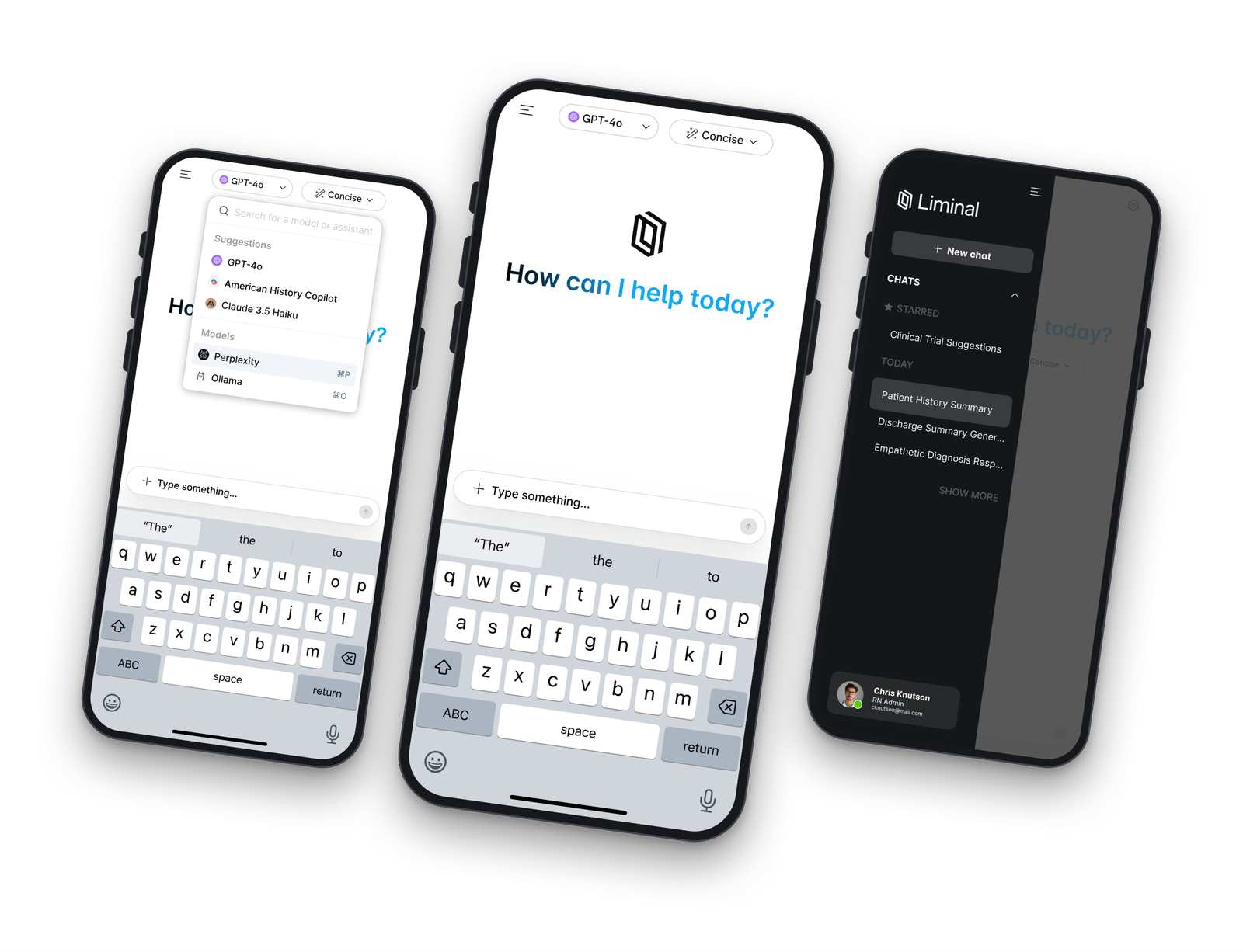
The mobile app isn't the desktop app squeezed. It's the parts you actually reach for standing up.
Phone usage is different. Short questions, one hand, often between other tasks. So the app leads with the composer and the model picker and pushes everything else into a drawer.
The states that matter most on mobile are the unglamorous ones. What happens when you lose signal. What happens when you cancel a response halfway. What a long-press on a thread offers you. Those are the moments that decide whether someone opens the app again, and they're the ones that get designed last on most teams.
As the lead systems designer, along with our Product Design team, we created Pando, Ibotta's first and very own Design System from the ground up.
We started with design tokens leveraged from our re-branding efforts to create, build, and implement components, patterns & elements that scale to all of Ibotta's platforms.
Process & architecture
Defining the architecture for a design system encompasses the seamless transition from design to development to implementation. It involves creating a comprehensive framework that outlines design principles, component libraries, and code guidelines. This architectural blueprint ensures a good workflow, fostering collaboration between designers and developers to efficiently bring the design system to life in the final product.
Wanna see it in action? Just ask!
Wanna see it in action? Just ask!
Wanna see it in action? Just ask!
Reach out to me at ck@chrisknutson.design
Reach out to me at ck@chrisknutson.design
Reach out to me at ck@chrisknutson.design